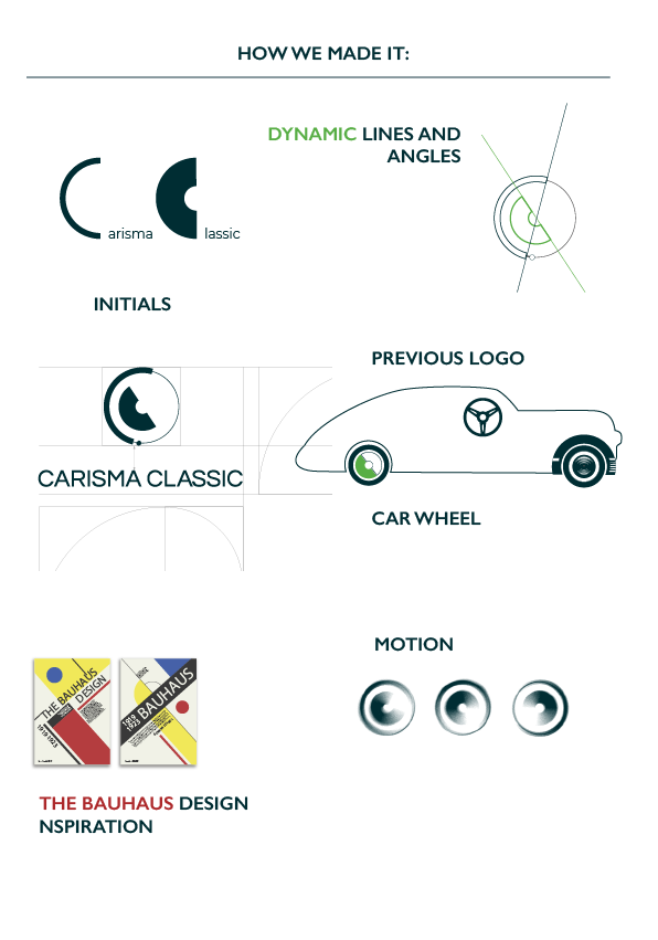
The Carisma Classic logo was created for a German company from the car trading business, with a focus on elegant, classic cars – works of automotive art. The logo and the remaining elements of brand identity were supposed to combine two brands: Carisma Classic (German market) and Carisma Cars (Spanish market). This requirement influenced the nature of the main elements of the designed mark, and the choice of colours.
Following the implementation of brand identity for Carisma Classic, the work for Carisma Cars was suspended for an unspecified period of time.
Previously, both companies used a rather random mark. It was composed of a steering wheel symbol and the business name.
When creating the new identity, we completely moved away from the old mark. The only remaining reference is the general circular shape of the graphic sign.
The graphic sign is a combination of several aspects:
1. It is composed of the brand initials: C.C. (common element)
The initials of both Carisma Classic and Carisma Cars.
2. The graphic sign is dynamic (befitting sports cars)
This effect is achieved thanks to the composition of elements, angles and dividing lines of the individual components of the graphic sign.
3. Geometric elements and same-height letters in the logo
These elements were supposed to constitute a loose reference to the Bauhaus design (these cars are pieces of art, after all).


Colour, mentioned before, was supposed to be yet another common feature of both identities. According to the original idea, two brands were to be created, which would share the same graphic sign, but have different names: Carisma Classic and Carisma Cars.
Our intention was for each brand to have its own secondary colour, but share one primary colour. The colour of Carisma Classic is green, while that of Carisma Cars is blue.
The primary colour is a combination of both of the above, matching both offshoots: green and blue. It was also supposed to be elegant, high-end, just like the Carisma Classic cars, and to look attractive in metallic version, evoking simple associations with car body paint. It can be also used for creating such elements like registration plates, car body parts, etc. Metallic colour seems crucial in the automotive business.
The logo and its main features were presented in simple guidelines.
The most important points and guidelines for the client are:
- Short description of the elements and of the story behind logo creation;
- Primary version;
- Horizontal version;
- Logo structure;
- Safe area;
- Minimum size for print and screen;
- a. Logo colours: (RGB, CMYK, Pantone, Hex Color)
b. Black and white versions - Colour versions;
- Suggestions of logo background;
- Unacceptable distortions and alterations.
(The above elements concern any logo design job; individual points may vary depending on the elements of brand identity and customer needs)
*These colours were used in previous materials and the customer wanted to keep them.
