Branding scope:
logo, selection of two typefaces for translations, social media graphics, document graphics
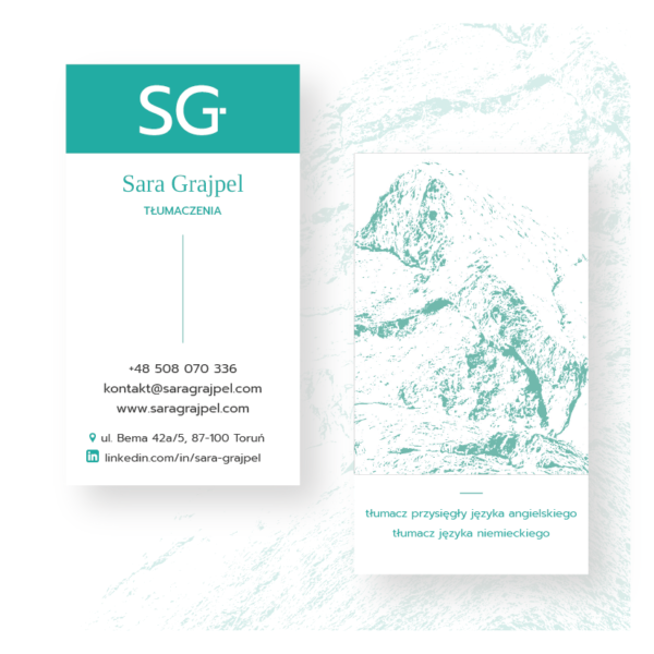
Logo design: a graphic mark, a signature for a sworn translator of English, Sara Grajpel. Her passion is climbing, so I used a vertical rock face theme in design. Main assumption: the mark and the remaining graphics shall be very personal and at the same time communicate full professionalism of the offered services.
The logo was created from:
1. A GRAPHIC SIGN: composed of the translator’s (Sara Grajpel) initials and the letter T (Translations) –> SG/T
+
2. THE FONT USED IN TRANSLATION
2.1. first and last name, written in a serif typeface, which is more legible, associated with traditional lettering and literary texts.
Sara Grajpel uses it for printed translations. They must be easy to read, the font should be flexible, i.e. contain both Polish and English characters and the maximum possible number of punctuation marks and special characters needed for translations.
2.2. The second font is a sans-serif font, used for digital texts.


